Product Marketplace Redesign
eCommerce platform redesign • UX Research • UX Design


Overview
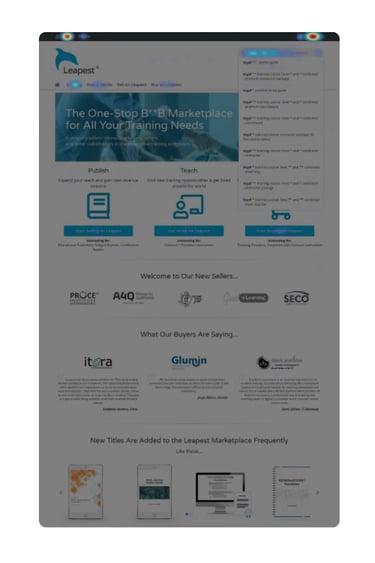
EdCast Marketplace is a global B2B e-commerce platform that enables corporate L&D teams to source their training products and services from a single, integrated learning ecosystem. In order to prepare, deliver, and complete any learning program, Training Materials are required, such as eBooks, Presentations for Instructors, or Exams to assess Learners. The Product Marketplace is a key component of this process, as it connects Buyers, searching for Training Materials, with the Sellers who create and/or distribute them.
The Product Marketplace was one of the first applications made public by the company. An MVP version was developed in 2017, using a third-party framework (Intershop). Although this allowed a quick release of the product, it created also several restrictions, from an engineering perspective, in addition to high licensing and maintenance costs. Consequently, by Q4 of 2018, the Design Team was formed and tasked with the redesign of this platform. While composed of multiple small projects, this portfolio entry serves as a high-level summary of the entire project.
Team
• 1 UX Analyst (yours truly)
• 1 UX/UI Designer
Timeline
• Q2 2019 - present
• Duration to MVP: ~10 weeks
My Contributions
• UX Research
• UX Design
Project Goals
Reduce costs and dependencies from Third-Party Applications
The MVP version of this platform was created using a third-party framework (Intershop), which proved to be very expensive and restrictive to maintain and expand.
Update the "look & feel" and establish a consistent branding
The use of a third-party application in combination with the existence of other different applications led to a very inconsistent branding and UI.
Establish a foundation for future designs
As the Engineering Team would be tasked to develop fully custom software, it was expected that this redesign would become the new foundation for future initiatives, both from a technical and a user experience perspective.
(Fix and) Improve User Experience
Based on the various issues identified with the MVP release of this product in terms of navigation, information architecture, and overall usability.
Challenges & Restrictions
Given the context of this project (a B2B platform) and the company's structure (a Start-up), there were some important factors that impacted our design process. These include:
• Limited access to existing and prospective end-users;
• Stakeholders to which the project is sold are often NOT the actual end-users;
• Need to (re)design a platform meant to be part of a unified system, while technically restricted at being in a separated application;
• Limited application scope - by the time of this project, other applications were already public - however, these were not within this redesign scope, meaning that some inconsistencies would still remain;
• The combination of general B2C aspects (as seen in eCommerce) with B2B constraints (e.g., complex processes with large volumes of information).
The Process
The process above is heavily based on the Design Thinking methodology (Empathise > Define > Ideate > Prototype > Test).

Review Previous Data
This stage is composed by the collection and review of available data from multiple research initiatives, summarized below:
(Note: due to NDA purposes, some of the examples below are blurred out)
Stakeholder Meetings & Interviews
Although applicable across any stage of a project they are particularly useful in the early stages. Among the various teams involved, our own Customer Support was particular helpful, as they have both direct contact with users and the context, often missing from other teams, like Marketing and Product.
These initiatives allowed us to: clarify company requirements and expectations, identify assumptions around the product and customers, and, perhaps more importantly, get a better understanding of our users, their tasks and workflows, as well as the perceived most common issues.
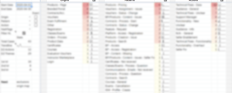
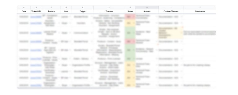
Thematic Analysis
Complementing the aforementioned Stakeholder Meetings is a large-scale thematic analysis that I have conducted over our customer tickets. The systematic analysis of this information allowed us to, more accurately, identify the users' most common types of issues, as well as general patterns in terms of topics, language used, requests, and overall communication.
If you wish to know more about this initiative, visit this page, where I summarize its overall goals, process, and outcomes.
Review of Past Documentation


By the time the Design Team joined this project, there was already extensive documentation regarding the product, created by other Stakeholders, such as Marketing, Sales, and Customer Support. Reviewing this information further complemented the insights from the aforementioned initiatives and allowed us to get a better understanding of the history of the product, how it has been seen internally and advertised externally.
Web Analytics & Behavior Tracking
Using applications like Hotjar and Google Analytics, we were also able to review and analyse the users' behavior with the platform.
On one hand, Google Analytics allowed us to inspect general platform-wide behaviors, such as seeing which articles in our Knowledge Base were the most visited, or which were the most common search terms used to find products. On the other hand, Hotjar allowed us to assess the platform on a page- and/or feature-specific level, as I was able to review recordings from actual end-users interacting with the platform, interact with them via polls/surveys, and visualize heatmaps of multiple pages of interest.

Raw Data Analysis
Another important source of information consists in our own databases, which record overall customer data, as well as all settings and configurations that they have used. Being quite well-versed in MySQL, it was relatively easy for me to gather and analyse anonymized data, so to better understand how often and in which ways the platform was being used (e.g., which functionalities are the most used? or how frequently are specific settings utilized?).
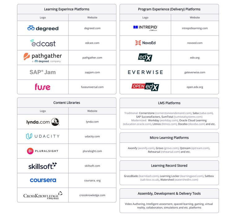
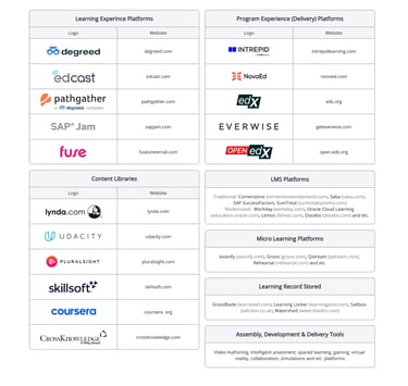
Comparing "Competitors" & Adjacent Platforms
Given the type of services provided by the platform, there was no clear competitor in the market. However, the "corporate" learning industry has existed for several years already, making it relatively easy to find relevant references.
The analysis of these references was, naturally, done based on multiple dimensions, from general aspects, such as how each one presented their services to customers, to more specific ones, such as the visual distribution of content and highlighted features. For summary purposes, a list of the most relevant ones is shown below, grouped by their most relevant category.
(Note: EdCast is listed as one of the references since this project began before the company was acquired by EdCast).

Research Insights: Summary
Through the aforementioned research initiatives, we identified some significant insights, summarized as follows:
Unclear (Visual) Identity
The use of an third-party framework, with limited customization, and a lack of clear visual guidance led users to complain often about the platform's "look & feel" (sometimes calling it outdated and clunky). More importantly, they have also expressed confusion in regards to whom the platform belongs to. For instance, it was not often clear who is actually selling the product, leading Buyers to contact our team, instead of the Seller's.
Conflicting Seller Expectations and Lack of Information
The lack of information and guidance across most stages of a purchase was one of the most significant issues identified. This situation was sometimes even more complex since some Sellers would instruct Buyers in erroneous ways, giving them expectations that did not match the reality.
Challenging Navigation
The limited capabilities of the framework used to develop the MVP lead to significant navigation challenges. These consisted of an odd folder-based categorization of content, which made very difficult for Buyers to find products, and for our Engineering team to enable the hosting of products from different Sellers and the access to other related applications provided by the EdCast Marketplace.
Long and Confusing Checkout
Some Buyers would often struggle with completing purchases. Between long checkout times, frequent abandonment and repetition of the process, and several tickets to our Customer Success team, it was clear that the existing checkout process did not support a good user experience. This issue was most noticeable with clients with down payment options, as they would often be fearful of having to pay the full amount before they actually needed to.
(Re/De)fining Users, Challenges, and Objectives
Combining the aforementioned requirements for this redesign and the identified issues, we worked together with Product, Engineering, and Leadership teams to define this initiative's objectives, summarized as follows:
Define a Consistent Foundation for future designs
• Develop a Design System (based on the Ant Design Framework) to modernize the overall "look & feel" of the platform and a set of Design Rules to further ensure consistency and brand identity;
• Define and Design a set of components and processes re-usable/applicable to upcoming projects.
Improve Product Discovery
• Design a "Mega-Menu" to allow users to navigate within the Product Marketplace's content catalogs more easily;
• Improve Filtering options and emphasize Important Information (e.g. base price);
• Provide and Improve Guidance regarding Product Access and Specifications.
Improve Checkout and Order Reviewing Processes
• Simplify the current checkout process - improve its information architecture and aim for a faster process;
• Allow an easy access to Buyers' order history (MVP version requires them to go to a different application);
• Allow Buyers to create Order Templates, in order to improve efficiency when re-purchasing.
Improve Seller-visibility and encourage Buyer<>Seller communication
• Design Seller Pages, so these have a more noticeable presence on the platform;
• Allow Buyers to define "Favourite" Sellers and to access their list of suppliers (i.e., Sellers with an established and/or frequent business relationship).
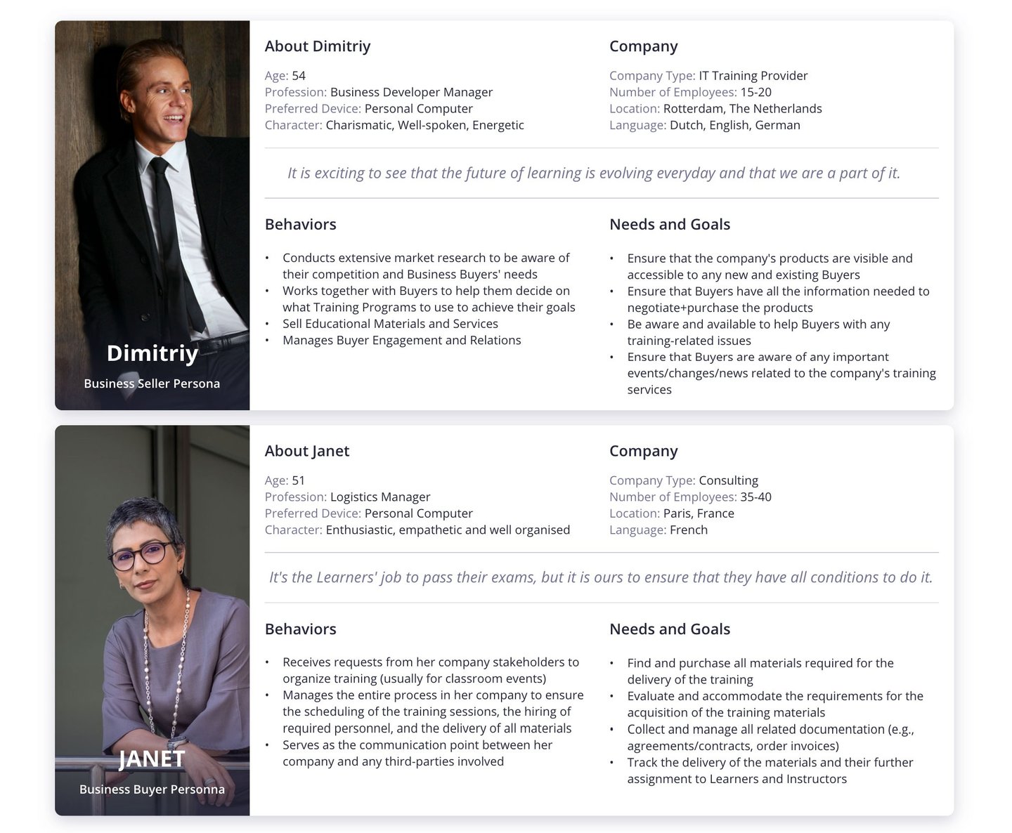
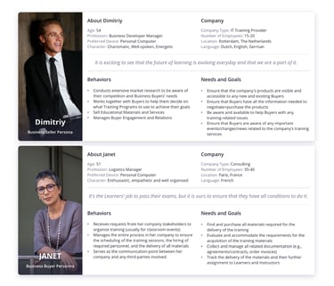
Personas
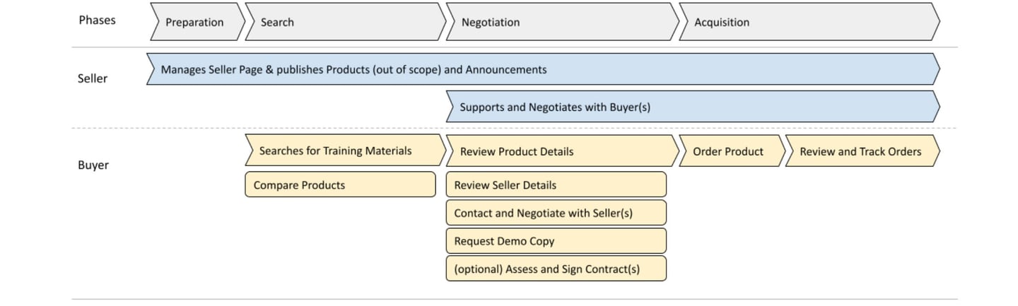
Identifying Core User Flows
Following the aforementioned steps, we proceeded to ideating over the various flows users would be put into, when using the platform.
Note that, due to NDA purposes, we are not allowed to present the full details of these user flows; therefore, below follows a summary of the most important flow of activities related to the Product Marketplace.
Prototyping: Principles
After the above, we began working on possible solutions through multiple sketches and low-fidelity mocks. Note that redesigning a full marketplace environment is not a trivial process and we must acknowledge the fact that this was constrained by various factors. Most of them were already mentioned in the Challenges section, however, three key principles had a crucial impact on our approach towards the final designs, namely:
Review-Design-Iterate
Being able to detect issues before users and stakeholders do is of the utmost importance. Therefore, before every design iteration, a quick usability review/design audit was conducted to detect potential user issues, potential gaps in the proposed design, or gaps within the design system.
High-Impact but Low-Disruptive Changes
Despite the "freedom" to redesign the platform, the available resources were still limited and we had to take into account that the MVP platform was already being used by several clients. More importantly, these clients had already adopted the platform into their own internal processes. Therefore, despite significant changes being needed, they should avoid disrupting these processes.
Function over Beauty
This project was created for a B2B context, where the platform is effectively considered as a tool for our clients, and it is often integrated into their own internal processes. This means that, although creating a visually pleasant experience is important, the quality of the information and its functions must take priority.
The following sections list a selection of wireframes and mock-ups related to various stages of this project. Minor deviations across the various designs may apply, as some of these include custom and/or extreme case features, only available for specific instances or because of features that, due to engineering constraints, became backlog items.
Prototyping: Wireframes/Low-Fidelity Mocks
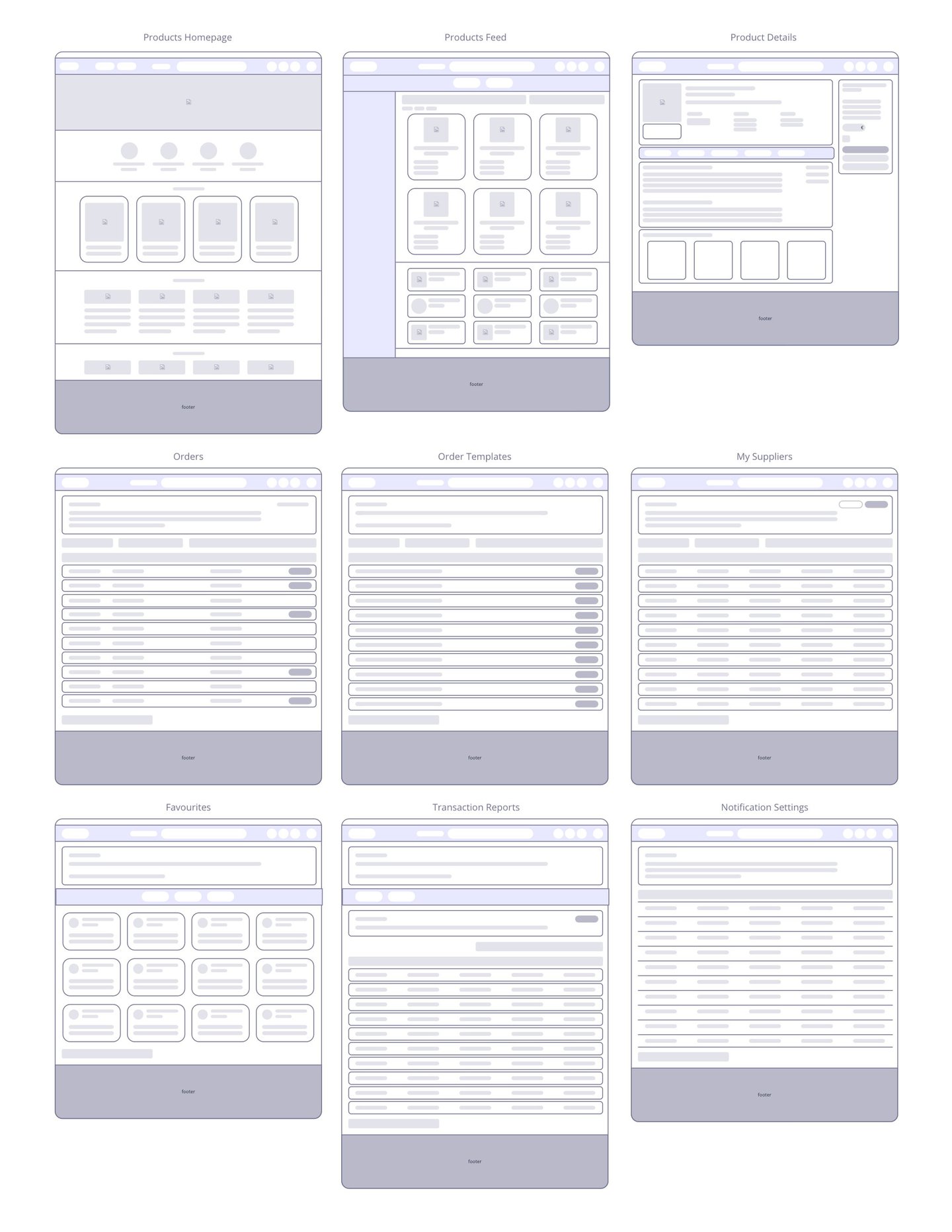
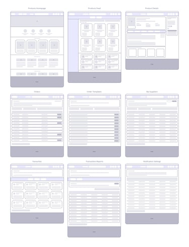
Prototyping: High-Fidelity Mocks
Landing Page and Top-level Navigation
Before
After
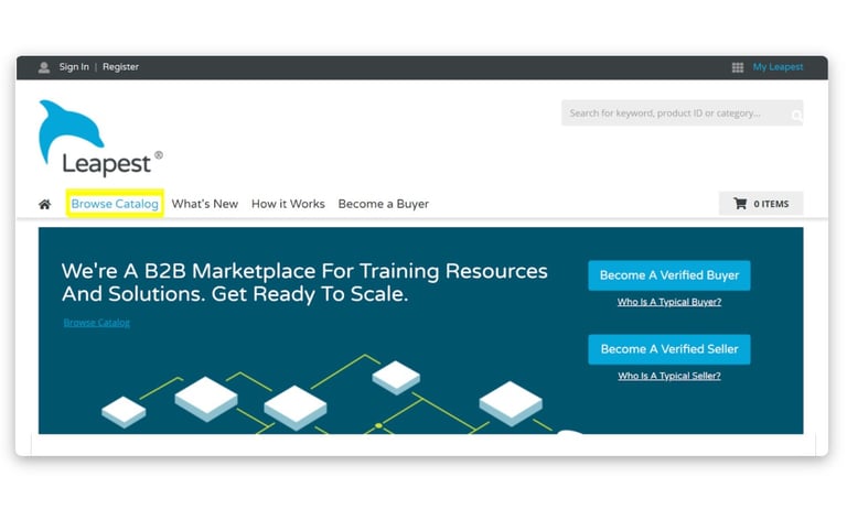
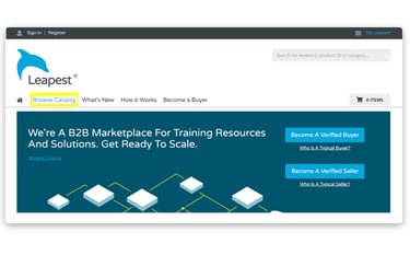
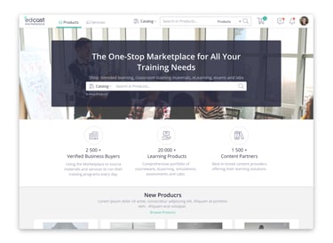
The MVP version of the Product Marketplace supported only one Catalog of products (IT Best Practices). However, as new Sellers joined the platform, it became necessary to support more catalogs. Consequently, we had to provide a solution that could handle this growth, while still being usable. To address this, we followed a "mega-menu" approach, commonly used in various types of eCommerce and Learning platforms. This mega-menu is divided into 3 layers, Catalogs > Topics > Subtopics. All information required to create this mapping is provided by the Seller when creating/uploading their products (this is outside of the scope of this project).
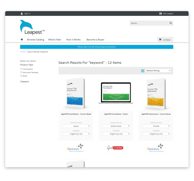
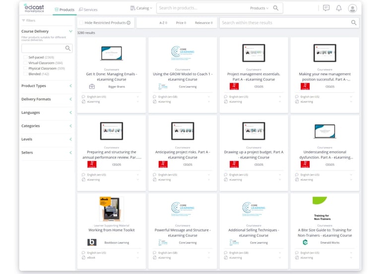
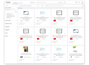
Catalog Search
Before
After

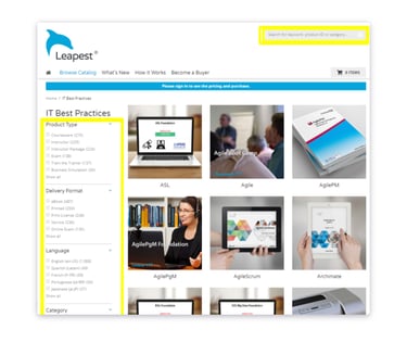
Improving product discovery (in a non-disruptive manner) was one of the key objectives of this project. As such, we had to make the information and actions available clear, while still keeping existing features that advanced users were already familiarized with. Below, follows one of the most recent iterations and a summary of the core changes to this page:
• Higher emphasis on the separation between different product tiles, lower emphasis to product thumbnails, providing more real-estate for information
• Added Seller information (name+logo), and Product-type information to allow an easier distinction between products (some Sellers tend to use the same names and thumbnails for different, though related, products)
• Improved distinction between restricted products and open-access products
• Moved the "Add to Cart" option, so it is not affected by the thumbnail
• Added option to favourite a product
• Redesigned (collapsable) filters
• New filters: Course Delivery, Sellers, Hide Restricted
• New sorting capabilities: Name, Price, Relevance
Product Listing
Before
After

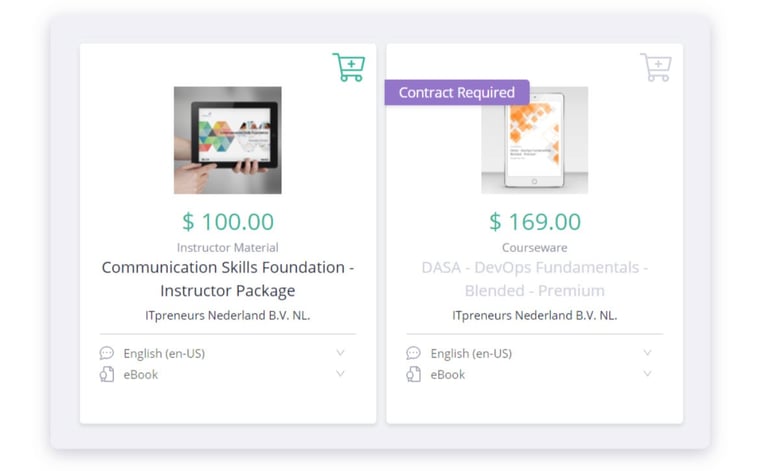
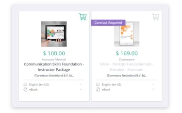
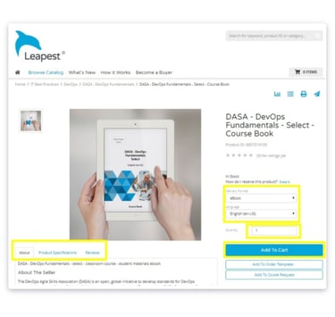
Open access vs Restricted Product
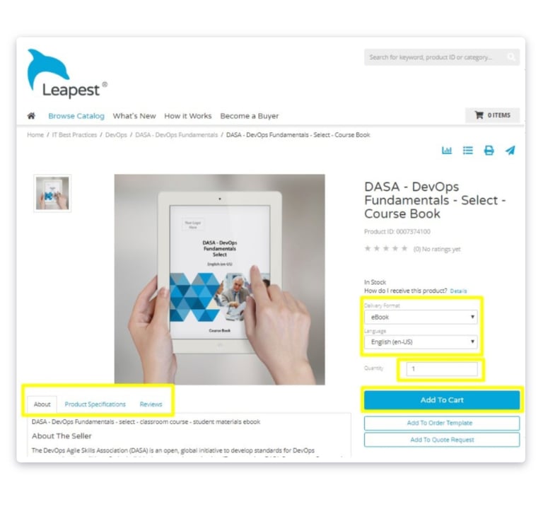
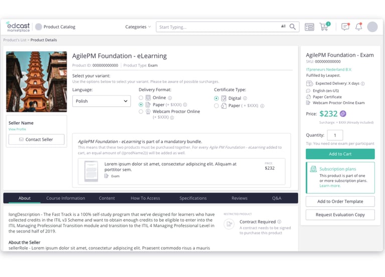
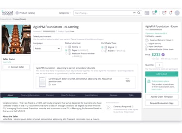
Below follows the comparison between the original and one of the final proposed designs for the Product Details Page. The most significant differences include:
• Higher emphasis on the Product Variant selection (i.e., selection of languages and delivery format), to avoid ordering errors.
• Lower emphasis on the product image, allowing for more relevant information to be shown above the fold.
• Display of Seller information, access to their page, and how to contact them, for both seller identification purposes and to encourage a more direct relationship between both parties.
• Additional metadata about the product and the selected variant are provided (information often used by Buyers for internal reporting).
• Updated copy and additional explanations for overall better guidance.
• Updated information architecture, such as by displaying Product information and specifications across additional tabs. Before this information was agglomerated into a single tab, making it difficult for Buyers to scan and find that information.
Product Details Page
Before
After
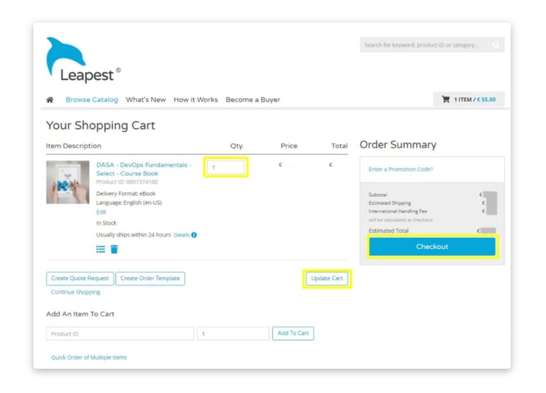
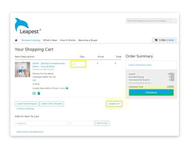
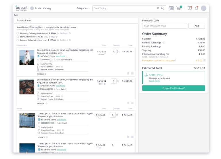
An interesting pattern identified with our research was the frequency with which Buyers would visit the Shopping Cart, in between adding products to it. This led to the Shopping Cart being visited often, even if only by small amounts of time. For that reason, we broke down the Shopping Cart into two views.
The first one is a simplified drawer view, quickly accessible from anywhere on the platform. This allows Buyers to quickly scan and confirm which products they have already added. The second one is in a full-page view, presenting all relevant information about the products, before proceeding to the checkout. Additional use cases are also supported, such as the testing of promotion codes (a common Buyer request).
Below follows the comparison between the original and some of the final proposed designs.
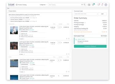
Shopping Cart
Before
After
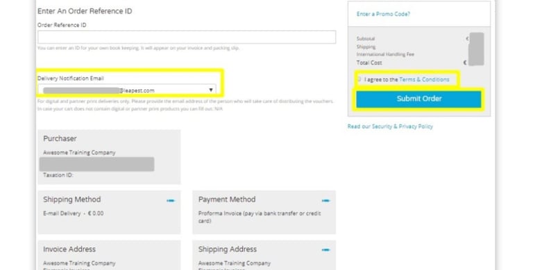
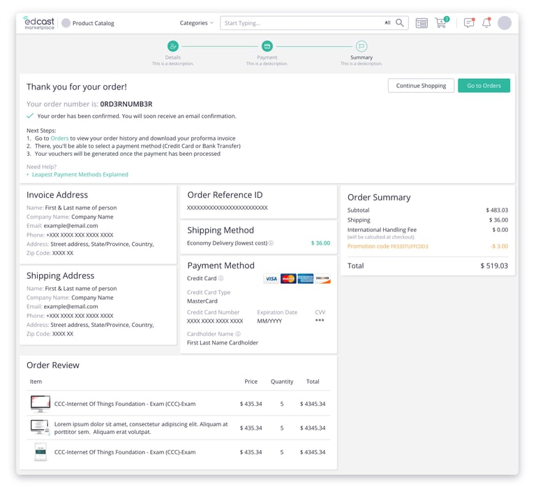
The checkout process is one of the red routes of any marketplace environment and, in this project, one of the main targets for improvement, from a technical, visual, and overall user experience perspective.
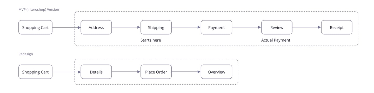
Not only the MVP process was too long, but it was also composed of single, and sometimes empty, steps. Frequently, the process would start in the second step. The payment step was only meant to select a payment method (often a single option for some customers). Payment would actually be done in the Review step, where, oddly enough, users would also be able to select delivery and shipping-related options. Moreover, it was not always clear to Buyers if/how to cancel or reverting the process, nor what would happen after an order had been placed.
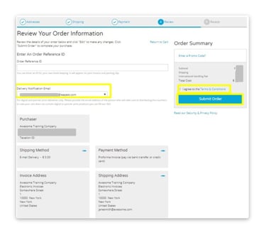
For this redesign, we simplified this from a confusing 5-step long to a 3-step process.
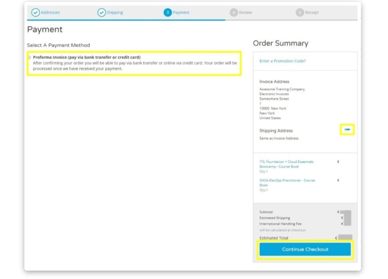
Checkout
Before
After
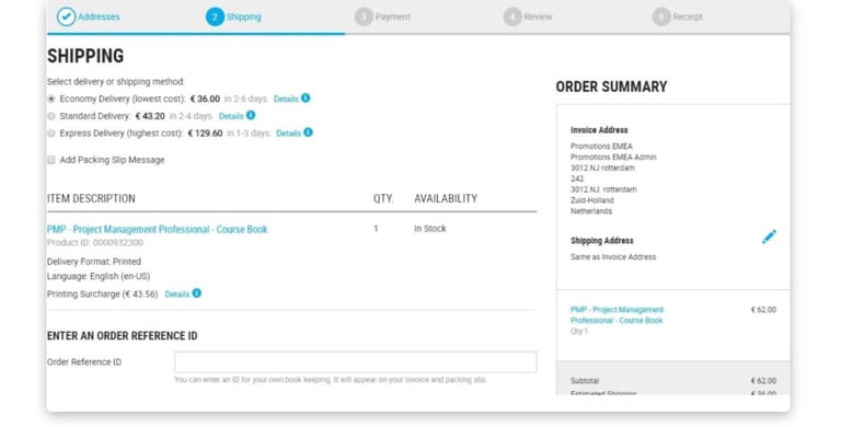
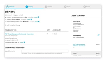
Below follows the comparison between some of the previous screens and the final proposed designs. The most significant changes include:
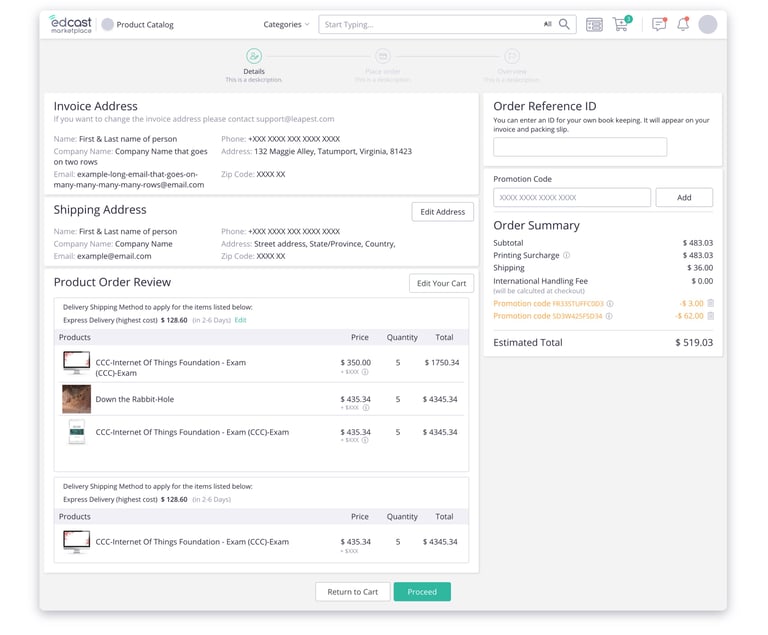
• The Details step allows Buyers to review their order: they Buyers can view their Invoice Address, select their Shipping address, and any other related options - effectively merging the Address, Shipping, and Review steps from the previous version;
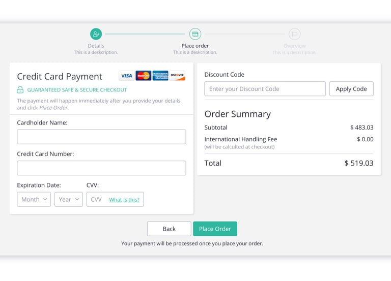
• The Place Order step replaces the old Payment step and allows users to select a payment method and finish their order;
• Additional guidance is provided on every step - particularly, in the last step, where Buyers are informed of what to do next;
• Clear Back/Proceed calls to action are provided when appropriate.
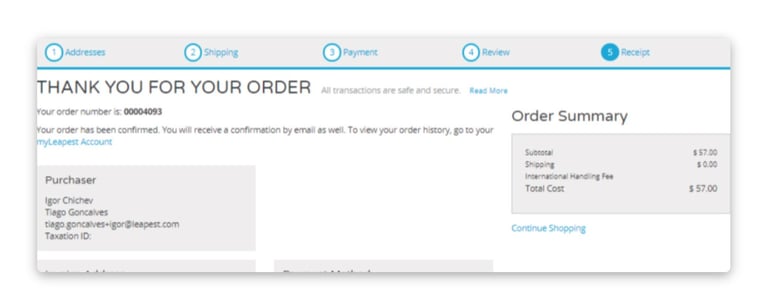
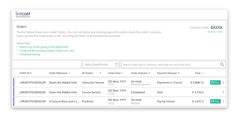
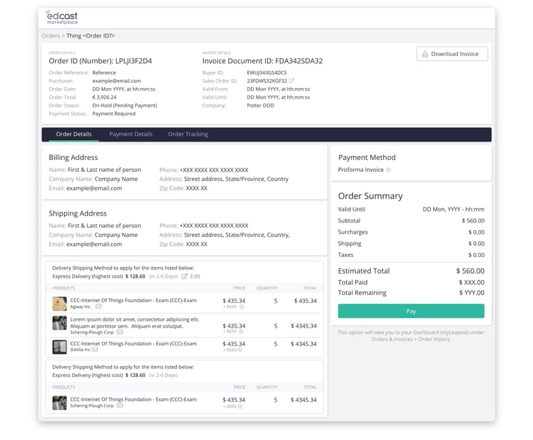
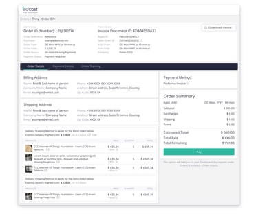
In the original MVP version of the Product Marketplace, the Buyer's Order History could only be accessed from a different platform. This made it difficult for Buyers to find out the proof of their orders - often a key step to ensure the delivery of the Product(s). We addressed this critical issue by adding the order history in this environment. Below follow some proposed designs of the overview and detail view of product orders.
Order History
Testing, Delivery, and Next (ongoing) Steps
The limited access to end-users and the very short time frame of this project, made testing iterations particularly challenging. To compensate for this issue, we focused our test efforts with internal stakeholders, through multiple interviews and quick user testing sessions. Once again, Customer Success was of the utmost importance, as these are the closest type of users to our own personas, both in terms of demographics and domain knowledge.
Naturally, this also made the identification and tracking of post-release metrics all the most important. Using the tools and techniques, previously mentioned in the Review Previous Data Section, we targeted information such as, but not limited to:
• Qualitative Feedback (e.g, collected via Surveys and support tickets) over the core features of the product, such as ease of use (checkout), ability to find information (product details page); general product satisfaction;
• Time spent on various pages, such as Checkout pages (collected via Analytics)
• Number of (unique) Customer Support Tickets received;
• Overall Purchasing Metrics, such as
• Revenue (Total, per Order)
• Number of Products per Order
• Most common Product Variants
Key Takeaways
Needless to say that this was a very large project and, while lengthy, not every deliverable has been listed here. However, by the time of the writing of this page, the feedback received so far from our customers was very positive, particularly, with our improved checkout and order history functionalities - a very positive result, given the scope, and constraints associated with this project. Below follows some of the key takeaways:
Start Research Early
Post-release metrics are very important. However, it was only due to various ongoing research initiatives, defined even before the project started, that we were able to acquire useful data.
Always Check Past Documentation
In every start-up, especially those following AGILE methodologies, it is common for different stakeholders to hold multiple functions. Thus, every individual is a potential source of valuable knowledge. We were able to gather useful qualitative and context information to help our decisions thanks to the involvement of various stakeholders, but also thanks to the analysis of some of their own deliverables.
Plan Big <> Design Small
To research and design a proper MVP, more than knowing which features need to be addressed, it is crucial to understand the context in which they exist and WILL exist in the future of the product. This greatly minimizes the need to redesign existing functionalities to accommodate new ones. For this to happen, you must be involved early in the project. Although there is an argument to be made in terms of the volume of designs that we produced (which, even now, are yet to be developed), it was also thanks to our early involvement and awareness of the "big picture" that we were able to collaborate as effectively and efficiently as we did with the remaining teams.