Comparing Methods for User Feedback on AI Recommendations
Survey • A/B Testing • UX Research


Context
The EdCast LXP is a Learning Experience Platform, used by corporate and SMB units (Small and Midsize Business) to manage and deliver company training. The LXP brings together content, such as articles, courses, or videos, from multiple different sources and recommends it to learners/employees, based on multiple factors, such as their job roles, acquired skills, and learning preferences.
To provide relevant recommendations to end-users, it is expected to have a system with robust artificial intelligence and machine learning rules. Although these can be learned based on users' actions, such as viewing, liking, or completing content, it can also be extremely enriching for these systems to receive direct user input, especially with a negative connotation, such as requesting to block content from specific topics and/or sources.
During Q1 2021, the Design Team was approached by the Artificial Intelligence Team to help them creating a method that allows users to provide negative feedback regarding the system's recommendations. This resulted in 2 proposals, which the Artificial Intelligence Team requested to learn which one would be better "from a UX-perspective". This page focuses on this evaluation step and summarizes the process and some of its high-level results.
Note: Due to the recency of this initiative and the fact that it deals with sensitive information about the product, that leadership stakeholders do not wish to see in public yet, several details, including the actual proposals, had to be omitted. Thank you for your understanding.
Team
• 1 UX Analyst (yours truly)
• 1 Director of Design
My Contributions
• UX Research. All stages, including:
- Review & Planning
- Experimental Design & Setup
- Recruitment & Execution
- Analysis & Report
Timeline
• Q1 2021
• ~ 6 weeks
Research Questions
The overall goal of this project was to provide better recommendations to our users. In the context of this step, however, 3 main research questions were identified:
(1) Can users understand the proposed solutions to provide negative feedback?
(2) Which of the proposed solutions is more likely to contribute to a better user experience?
(3) Which of the proposed solutions is more likely to be used?
Methodology
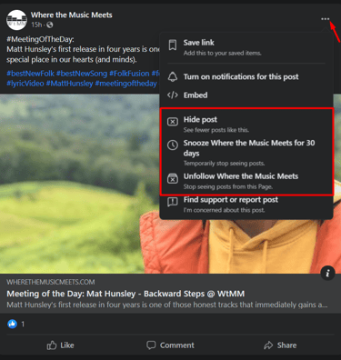
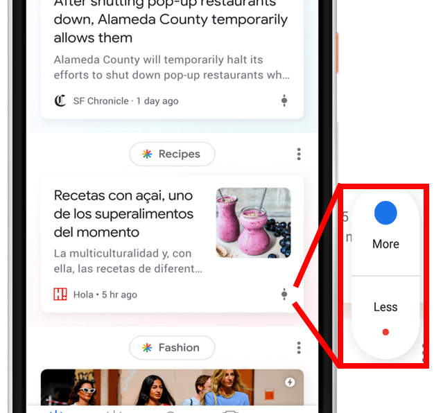
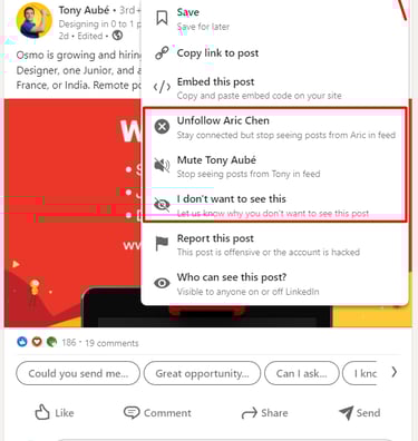
To address the objectives of this project and before the evaluation of the proposed solutions, I contributed with a Competitor/Adjacent Market Analysis, to help identify, and compare their properties, advantages, and disadvantages, of some of the most common methods used to provide negative user feedback, to AI driven recommendations. Relevant examples include the approaches followed by Facebook, Google, and LinkedIn, shown below, respectively.
Previous Contributions
From the results of this analysis, the Design Team proposed 2 solutions. Due to the already mentioned reasons, I cannot display them. As such, for a simplification of language, and for the remaining of this page, I will address to each solution as Icon Menu and Context Menu, respectively. Each proposed solution had its pros and cons (summarized below) and would require different back-end implementations, making an end-user solution validation all the most important.
Icon Menu
+ High visibility - theoretically, easy to find
+ Support of positive feedback
- Lack of guidance/context
- Potentially high visual clutter
Context Menu
+ Supports more guidance/context
+ Less visual clutter
- Potentially hard to find
Constraints
Even before I could propose a procedure to evaluate the solutions, some relevant constraints became clear, namely:
• Short-timelines: by the time of this project, the team had received some complaints regarding the quality of the recommendations, particularly by one of our largest customers. Therefore, there was some incentive to present solutions as soon as possible;
• Technical and resource limitations: despite the very technical nature of this project, it was informed to us that it would not be possible for the Artificial Intelligence Team to develop any sort of prototypes implementing the proposed solutions;
• Limited reach: although the aforementioned customer agreed to be a partner for this project, they did not want their users to spend too much time interacting with our organization - meaning that, in addition to the other constraints, any potential methodologies that involved direct and prolonged contact with end-users (e.g., interviews, user studies) were very unlikely.
Experimental Design
Based on the aforementioned research questions and the imposed constraints, I proposed a Within-Subjects Unmoderated User-study, combining principles from surveys and A/B-testing.
Structure
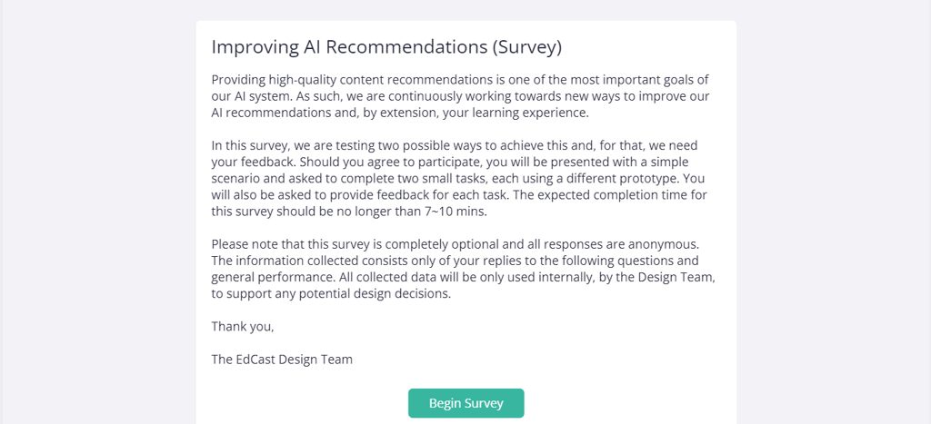
Using UXPin, our tool for the creation of low- to high-fidelity mockups, I created a survey-like prototype to collect quantitative information on how users would utilize the proposed solutions and gather their qualitative feedback. This "survey" was structured as follows:
(1) Introduction - the overall goals and specifications of the experiment are presented to the participants;
(2) Task - the participants are presented with a scenario in which they were recommended content that they are not interested in and they are asked to inform the system about it, using whatever tools provided to them. This task shows them an high-fidelity representation of one of the proposed solutions.
(3) Task feedback - participants are asked to rate a series of affirmations, inquiring them about:
- Their perceived (future) usage of the feature;
- Ease of use;
- Complexity;
- Expected Outcomes.
(4) "Repeat" steps 2 and 3, using the other proposed solution.
(5) Comparative preferences - participants are asked which of the two approaches they preferred. They are also invited to provide any comments regarding their decision.
Completing all of these steps has an expected duration of, approximately, 7 to 10 minutes.
Independent Variables
This experiment had one independent variable, Feedback Method, with two variants, each corresponding to a proposed solution:
• Icon Menu
• Context Menu
To mitigate sequence effects, the order by which each solution is presented to participants is randomized (50% change for each task flow).
Dependent Variables
• Efficiency - Time per Task (sec)
• Effectiveness - Number of Errors: i.e., number of clicks in options that do not help the user achieve the goal of the task. Each option contributing to this state was also measured.
• Subjective Preferences
- Likert-scale replies for the feedback step on each task;
- Preference rating between both Independent Variables;
- General comments provided in the open answer question.
Hypothesis
H1. There will not be a significant difference in terms of efficiency.
H2. The Icon Menu solution will lead to lower effectiveness (H2.1. especially after interacting with the Context Menu solution first).
H3. Participants will prefer the Context Menu solution.
H4. There will not be a significant difference in terms of feedback for each solution.
Customer Partnership
For this experiment, we partnered with the customer that was the most interested in the development of this feature. Despite the, aforementioned, constraints, they supported our reach towards their end users, by sharing the prototype created for the acquisition of data.
Before that, we informed the customer about all details of this experiment, including all data points that would be collected. Moreover, a pilot study was ran with our contact points to that customer, before end-users were approached. These end-users were part of the customer's own pool of testers.
Replies were gathered form end-users for approximately 2 weeks.
Tools


Task Execution & Data Connection
Data Logging and Statistical Analysis
Report and Communication
Results
Due to the recency of this research initiative and the (sensible) information involved, I will not be able to show any specific results. Nevertheless, below follows a summary of the process and some of the most relevant insights.
Procedure
A total of 47 participants volunteered for this study, with a distribution of 23-24 in regards to experiencing the Icon Menu or the Context Menu solutions first, respectively. No technical issues were detected during the conduction of the tasks.
The results were compared based on three main factors:
• Efficiency: Task Completion Time
• Effectiveness: Number of "Wrong Clicks"
• Subjective Preferences: Preferred Method and Subjective Ratings
Efficiency
No statistically significant differences were detected when comparing Task Completion Times between the two solutions, both when analysing global task completion, or just the data from the first task of each participant.
If you are curious about the statistical procedure:
To calculate these results, first, a Shapiro-Wilk test was used to calculate if the data was normally distributed. After that, if looking at the data from a within-subjects perspective (i.e., data from participants using both solutions), a Wilcoxon signed-rank test was used to assess any significant differences. On the other hand, when looking only at the first task from each participant (i.e., between-subjects perspective), either an Unpaired T-Test, or a Mann-Whitney U test were used, depending on if the data was normally distributed or not, respectively.
The results showed us that participants committed a statistically significantly higher number of mistakes when using the Icon Menu solution. This was observed regardless if the participant had used this solution first or second in the experiment.
The same statistical procedure as above was used.
Effectiveness
Subjective Preferences
Overall, 70% of the participants preferred the Icon Menu solution over the Context Menu (32 vs 14). No correlations were detected between the preferred and first-viewed solution.
Analysing the different scores/agreements in both tasks, while marginal, significant differences were also found, namely that:
• The Icon Menu solution had a significantly higher total score than the Context Menu.
• Participants would expect to use the Icon Menu solution more than the Context Menu.
• Although both approaches were considered easy to use, participants rated the Context Menu solution more complex than the Icon Menu.
If you are curious about the statistical procedure:
A Pearson's Chi-squared test was used to verify correlations, while Wilcoxon signed-rank tests were used for verifying statistical differences.
Comments
A total of 25 participants commented on their preferences. Combining thematic analysis and affinity mapping principles I identified some of the most common patterns, summarized below:
Icon Menu
+ Faster / Easier to use
+ Likely to use it more
- Not the most common approach. It can be hard to find and understand at first
- Options may not "feel enough" / How would these options truly help?
Context Menu
+ Most familiar approach, based on other platforms that they use
+ Options provide granularity
- Options can be complex and/or not completely represent the participant's intentions
- More time and/or effort required to think about it
Summary
Combining our quantitative and qualitative analysis of the results, we can infer that:
• H1 is supported - no significant differences were detected when comparing task completion times
• H2 is supported - significant differences were detected in terms of "wrong clicks", both from a within- and between- subjects perspective
• H3 is refuted - Most participants preferred the Icon Menu solution
• H4 is partially refuted - Comparing the ratings of both tasks, significant differences were detected in terms of the expected frequency of use and perceived complexity.
Icon Menu
+ Preferred Solution
+ Potential to be used more often than the Context Menu solution
+ Considered as less complex
- Harder to find (and understand, at first)
- Likely to cause more mistakes
For a successful experience, it would require:
• Clear guidance and iconography
• Time for users to properly learn and become acustomed to it
• Potential "links" to other features, to prevent mistakes
• Engineering effort, to ensure a proper implementation
Context Menu
+ Safest solution: matches user's expectations
+ Less mistakes
- Considered as more complex
For a successful experience, it would require:
• Clear options
• Engineering effort, due to additional changes that would be necessary to the platform's front-end (out of the scope of this discussion).
Reporting the Results
The full version of the results presented above, alongside recommendations for future work, were reported to the Design, Product, and Artificial Intelligence teams in 2 main formats:
• Presentation: slides summarizing the study, results, and relevant resources;
• Dedicated project page (on Confluence), visible to the entire organization. This includes all of the resources used in this study, such as planning documents, study guides, documents used for the analysis, and summarization of the results.
Outcomes and Takeaways
Despite the very significant constraints associated with this project, through this research initiative, we were able to evaluate the two solutions proposed by the Design Team, and identify the most likely conditions that would make either of them a successful user experience.
I do consider this project particularly interesting to share, given that:
• This was the first time that we were approached directly by Engineering to conduct user research.
• This was the first experiment under our EdCast <> Client Research Partnership Program. (*)
• My background in computer science had a significant role in minimizing the effects of the aforementioned constraints.
(*) While, in the near future, I may add a dedicated page to this initiative, to summarize, this is a program developed by myself and my Manager at the time (Pietro Masi - Director of Product Design) aimed at the conduction of dedicated user research together with our clients. One of the branches of this initiative aims to research topics that may consist of pain/interest points to our clients, while still aligning with EdCast's product strategy.